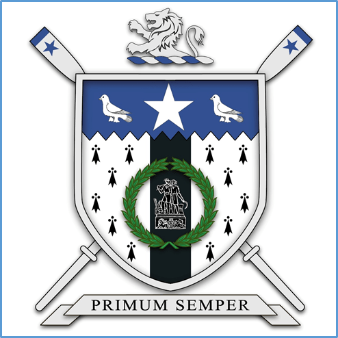
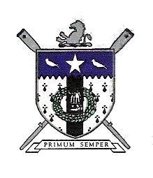
In our 150th year, graphic designer and club secretary, Sian Blohm, worked on updating the club crest. This crest was designed originally in 1934-35 season when the club called for original designs for a club badge to be used on blazer pockets. These were the days when the sartorially elegant members would head off to regattas resplendent in the club blazers and ties. It was designed by Gordon Whitworth who obviously had an interest in heraldry. The annual Report states that his design was selected as it was “in every way and ideal emblem of the sport which it represents and the club’s Esprit de corps.”
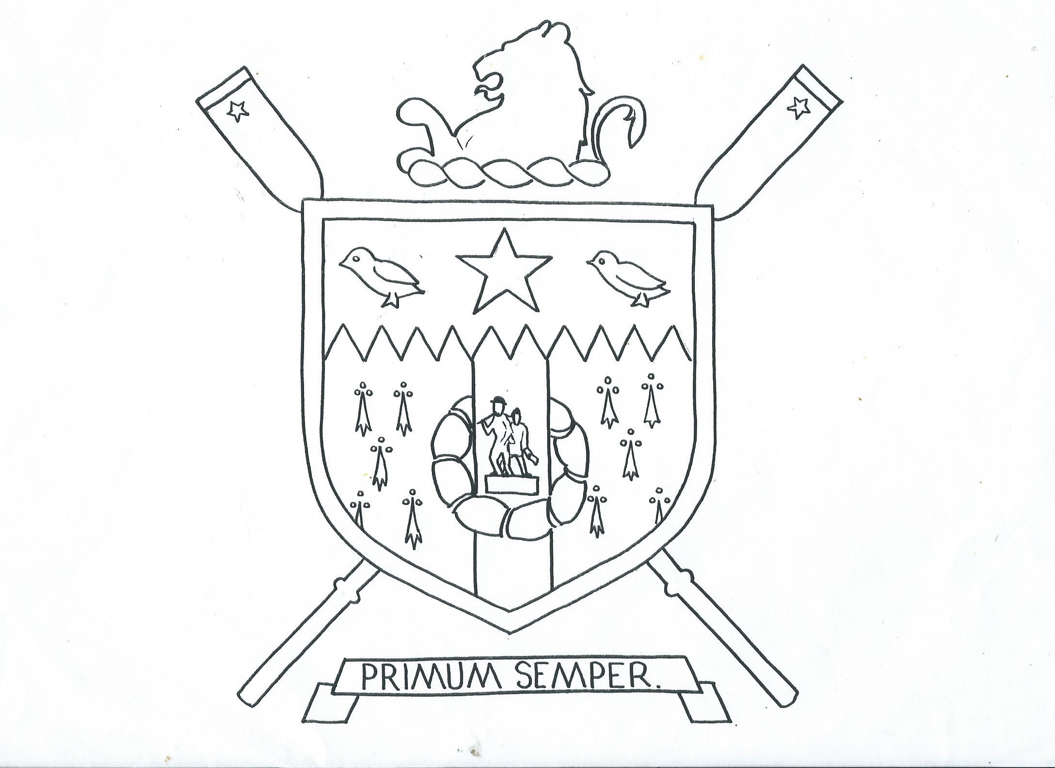
Sian meticulously went through the separate elements of the design and in consultation, worked on producing a cleaner, clearer image. The only image we had had previously was from a club letterhead which was very small and did not enlarge very successfully. In 1986, I also did a line drawing of the design that we could use on club windcheaters but it was uncoloured and the elements only as clear as I could hand draw them! To have someone with Sian’s expertise and graphic design experience was fantastic. She was able to research and put together a design where all the separate elements were clear and distinguishable. She and I worked through the elements and were possibly the only club members to get excited by choosing the best “Lion Rampart” or “Martlets” to suit the revamped crest! Who knew there were so many different martlet (dove) designs!
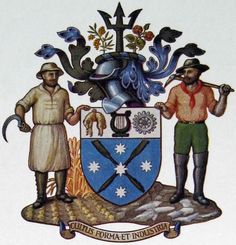
The centre of the crest is the City of Ballarat Coat of Arms featuring the miner and the farmer. On the small letterhead image, it looks like a collection of squiggly lines. We knew it was the Coat of Arms from the City of Ballarat as in the Annual Report of 1932 there is a description of the elements. I had always assumed that it was the most recent Coat of Arms but in assisting Sian with research she realised that there were two different iterations of this. The one I had assumed it was, was designed in 1956, updated for the 1956 Olympic Games. To find a copy of the original lead me to the Town Hall and there on the stairs was an etched glass image of the original design. I took a photo of this, sent it to Sian and she was able then to replicate it as it should have been.
The motto has not changed. This is what Gordon Whitworth wrote to accompany his design.
PRIMUM SEMPER “Always to the fore”. This is a fitting motto for a club, particularly a rowing club, and is a motto for the club and the members individually, both in rowing and club affairs.
The literal translation means of Primum Semper means “First always”! That is maybe a little hard to live up to especially in racing!
My interpretation has always been that the club should always strive to be to the fore of rowing activities and the individual members should also strive to be to the fore of club activities, working together to further the interests of club and of the sport of rowing. This still is relevant and meaningful today. We certainly took it seriously when we were racing and training and “Always to the fore” meant trying to be at the fore front of our races!
Many thanks must go to Sian who has made a significant contribution to the club in producing a beautifully rendered version of the crest that is true to the original but a much clearer and cleaner version that will take the club into the future. You can see more of Sian’s work at designstudioballarat.com.au.



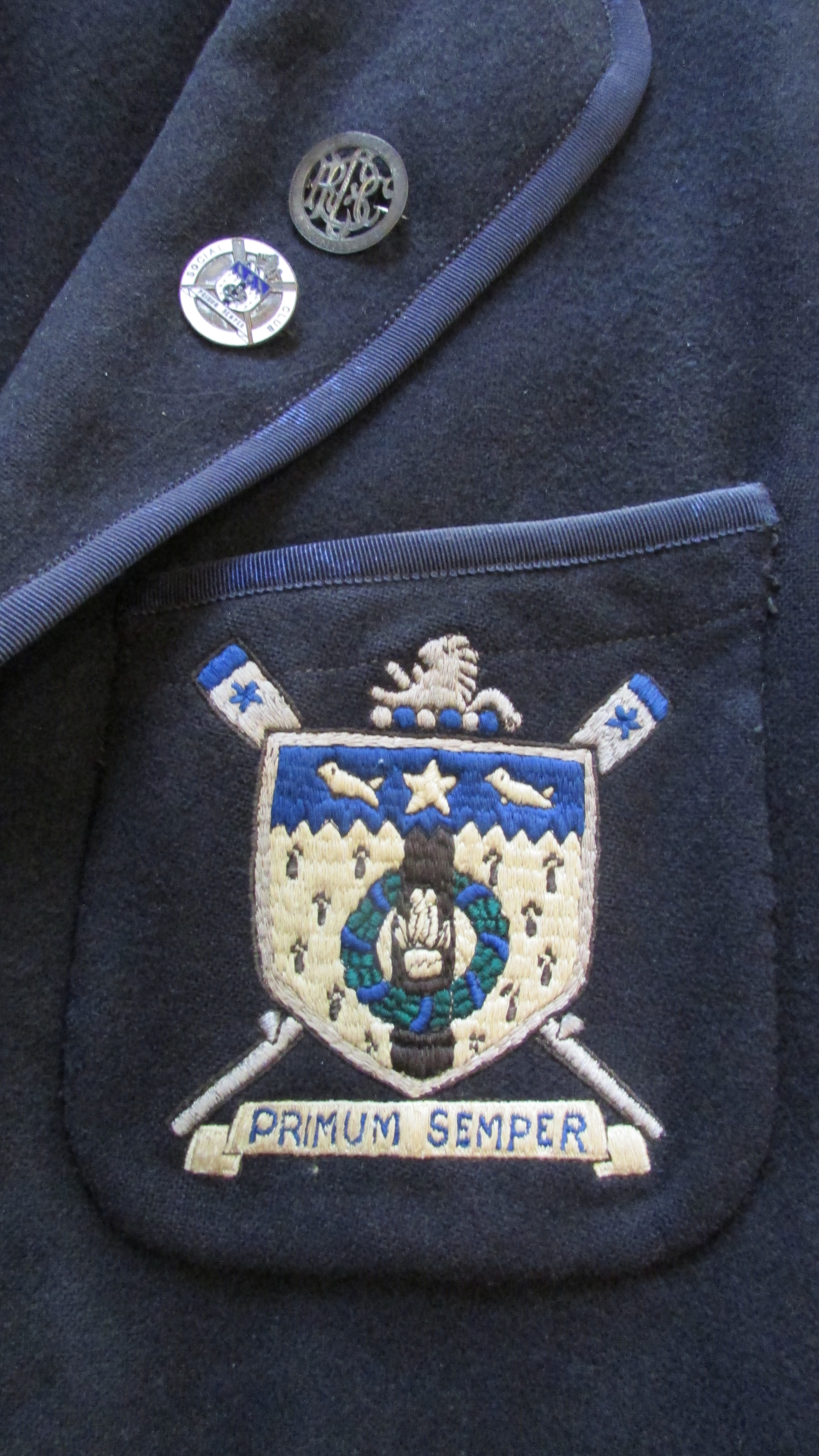

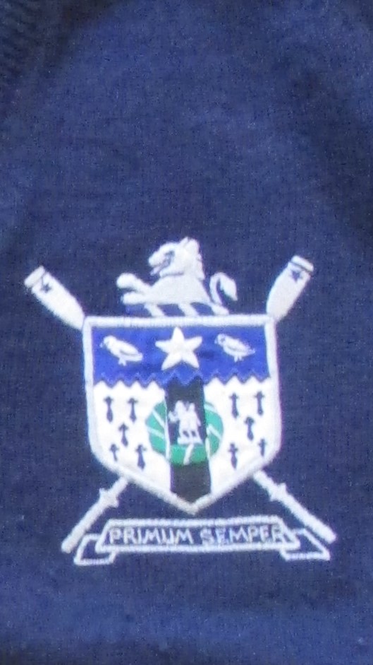
Crest on blazer pockets from 1950’s, 1960’s and jumper from 1970’s.
